IMPINJ
Website Redesign for an RFID Data Company
Partners
Lindsay Shelmire (Project Manager) Morgan Kim (Visual Design)My Role
User Experience Design User Interface Design Content Strategy
Client
ImpinjProblem
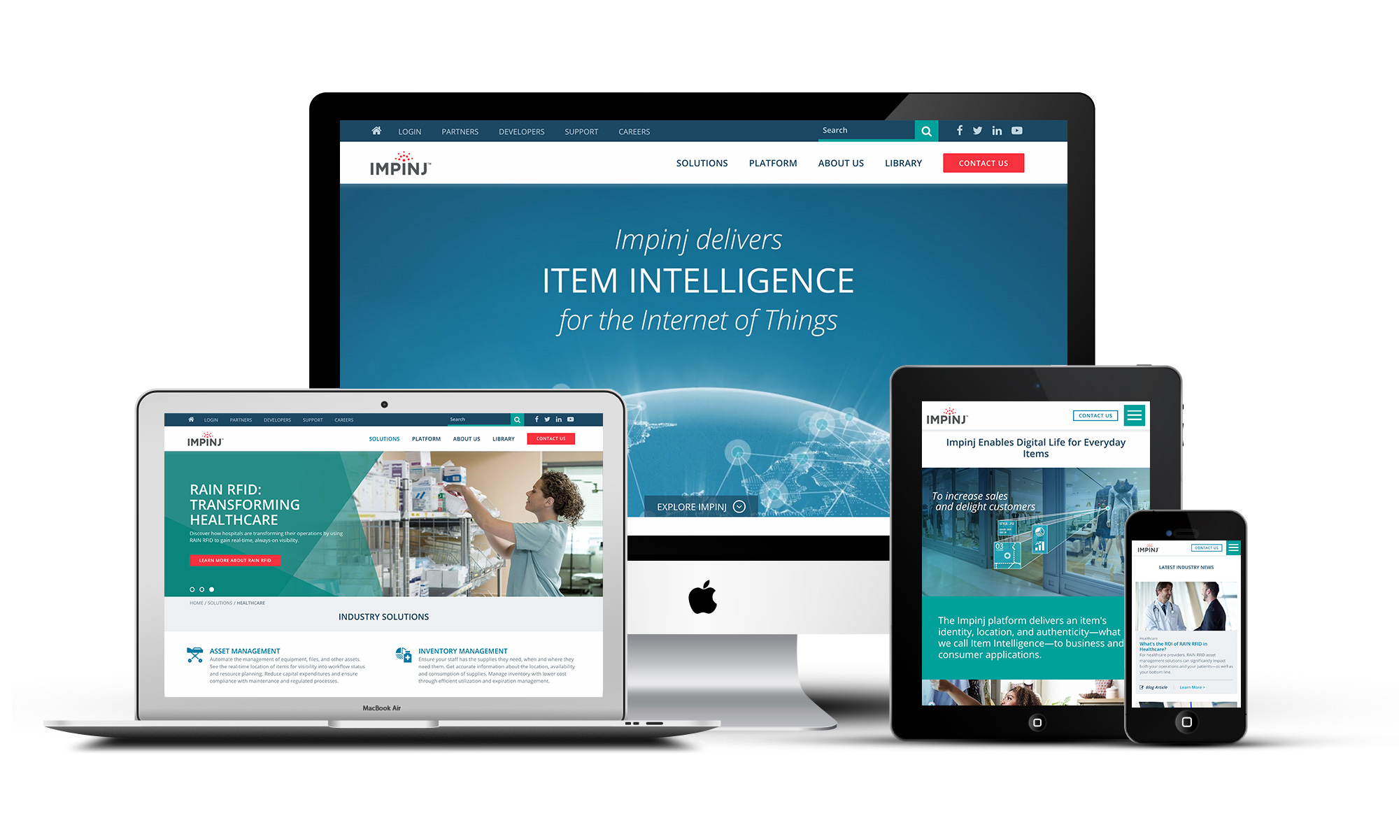
IMPINJ hit the ground running as a startup with bleeding edge beacon analytics products and technology. Now an industry leader of RAIN RFID products, IMPINJ needed a marketing website to match the needs and expectations of its client share.Challenge
Our team at 8ninths endeavored to build a new site from the ground up. Our user experience design and content marketing strategy needed to accommodate 9+ user groups, a flexible and customizable theme, 9 unique page templates, and a simple and intuitive experience for site admins.Solution
Over the course of 6 months, Lindsay and I held weekly meetings with 5+ stakeholders to explore challenges, discuss strategy, map, plan and execute our approach. Impinj unveiled the new site this April 2017.Process
Background Research
Our process began with a deep dive into industry research, competitive analysis, and a content audit of their existing website. We identified a number of key players targeted at either one or multiple industries and assessed their approach to content marketing. This gave IMPINJ the opportunity to voice what set their brand, products and services apart so that we could discern how best to represent them in our designs going forward. Thereafter, we combed through site pages for available pdfs, white papers, and case studies to better understand the IMPINJ platform and ecosystem. With this information and weekly meetings to align with the content team, we built out a site map as a point of discussion to understand how our different audiences would find and digest the appropriate content for their needs.[gallery link="file" size="full" ids="258,259,260"]
User Research
Following our initial research, IMPINJ arranged for us to meet business development leads in the Health and Retail verticals. We asked our contacts to step into the role of their clients so that they could answer our questions from the mindset of their unique customers. These interviews shed a lot of insight onto specific industry buzz words, pain points and interests. We translated these learnings into high level personas to validate with our contacts at IMPINJ.[gallery columns="2" link="file" size="full" ids="255,254"]
User Scenarios, Flows & Content Audit
User scenarios mapped the needs of our various user groups to tasks they needed to perform across the site. Meanwhile, we were also hard at work in conversations with the content team at Impinj, to understand the specifics of the products and technology vertical, the various industries and their unique selling points, and the library of reference materials users would need to access at different points of their decision-making process.Wireframes & Prototypes
In our first pass, we laid out the content for the various industry solutions and technology products pages in a linear format, to ensure understanding and buy in from the user. Different pages would have different target audiences. But in discussions with stakeholders, we reached agreement to design a more modular layout that could bridge audiences to the content that mattered most. To communicate our ideas and track feedback from the client, we presented wireframes with Invision's prototyping application for each user flow across all site pages.[gallery columns="2" link="file" size="full" ids="266,264"]
High Fidelity Compositions
With our content and flows solidified across the majority of site pages, Morgan Kim came on to move the project into its final phase for visual design. I provided consultation for the functionality of various design elements and concerns for front-end development.[gallery columns="2" link="file" size="full" ids="267,268"]